Mobile Gadget Web's Mobile First Websites
Created To Meet Or Exceed Google's Mobile First Best Practices
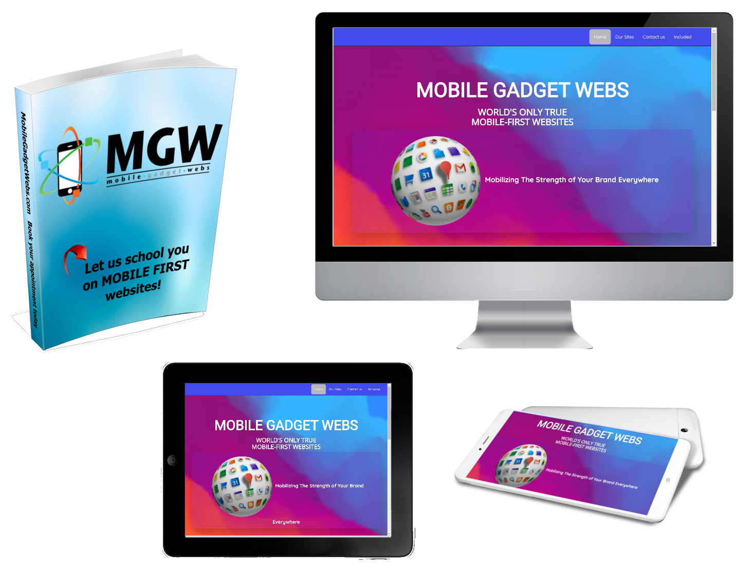
The mobile first approach is exactly as it sounds: designing for the smallest mobile screen and working your way up to tablets, ipads, laptops and desktop computers. Our sites are built with an adaptive design; meaning that we have created a website and webpage layout designed for each type of mobile device, tablet and desktop system.
Our system recognizes and adapts to the screen size of the visitor. When a search is done it recognizes the device as a mobile phone, a tablet or desktop, and presents the perfect website or webpage for that specific device.
In the past, and even today, nearly every system creates a website for the desktop first, resizing, or reducing that page down to fit a mobile device, tablet or laptop. Resizing slows down the delivery to your visitors, and depending on how slow the site is presented, you could potentially loose a customer.

What You Will Get With Our Mobile First Websites
A Website Built For Mobile Phone First
If your trying to make a first impression with your customers and clients on their mobile phone, you can do it with our mobile first technology websites. Our websites are created specifically for mobile phones first. It doesn't matter if your phone is using Android OS, Bada (Samsung), iPhone OS, MeeGo OS (Nokia and Intel) or any of the other operating systems, when someone does a search for your site, the website presented will fit their phone perfectly, and load extremely fast.
Fast page speed is what your customers and clients demand in todays online world. Our websites will keep your customers from going somewhere else, because they won't have to wait for the webpage to load.
Exceptional User Experience On Tablets
We have taken the same technology that was created for mobile devices and used it to create the best user experience for those that spend a lot of time on their tablets.
It's a fact that both mobile and tablet usage and sales is done in the late evening hours and on weekends. Tablets surpass mobile phones by a large number, and are used for a much longer period of time everyday. Because of that, we ensure that the user experience for tablets is second to none.
The Indomitable Desktop Computer
Yes, it's true that around 50% of all searches are done on mobile devices and tablets. However, that only accounts for HALF of the online searches worldwide.
What does that mean for you and your clients? The other 50% is being done on laptop and desktop computers. They haven't disappeared like the dinosaurs many say they are; they are still around and being used every single day.
While there is such a huge push for mobile page speed, you should never overlook the indomitable desktop or laptop computer. And we haven't. With Mobile First technology, we've created the perfect desktop delivery system that is fast-loading and easy to navigate.
To add this web app to your homescreen, click on the "Share" icon
![]()
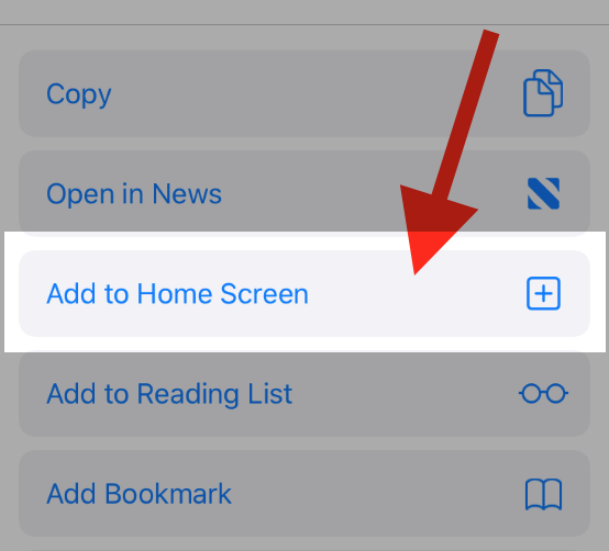
Then click on "Add to Home"

To add this web app to your homescreen, click on the "Share" icon
![]()
Then click on "Add to Home"

It looks like your browser doesn't natively support "Add To Homescreen", or you have disabled it (or maybe you have already added this web app to your applications?)
In any case, please check your browser options and information, thanks!
It looks like your browser doesn't natively support "Add To Homescreen", or you have disabled it (or maybe you have already added this web app to your applications?)
In any case, please check your browser options and information, thanks!

